The Audit View screen or Dashboard is designed to give you the most important information at a glance.
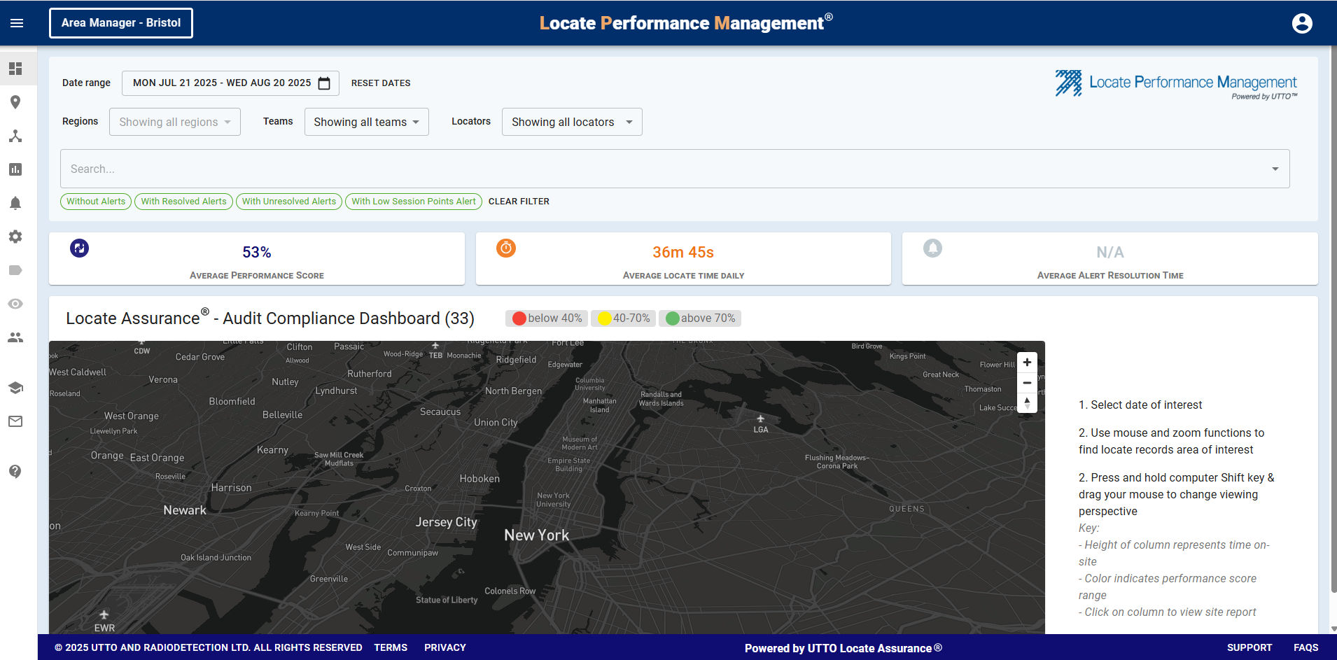
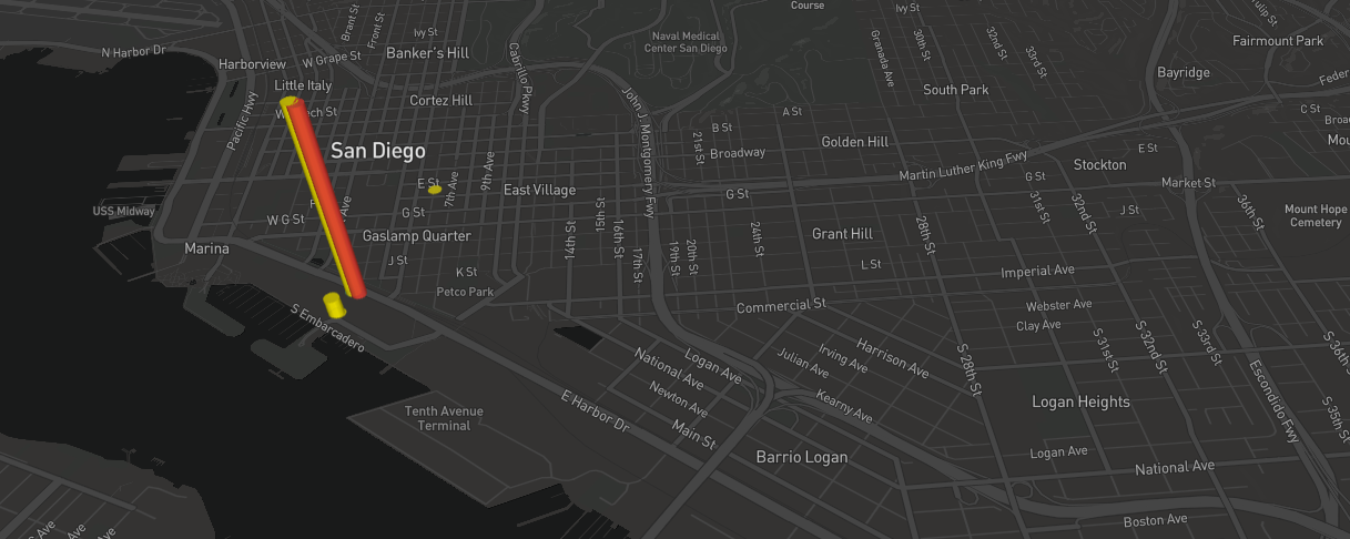
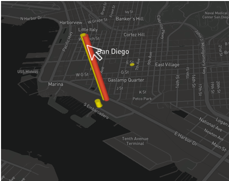
The 3D map on the dashboard gives you the opportunity to see every locate completed in the area you choose, on the day you choose.
The information is presented in such away that you can instantly see trends and inconsistences.
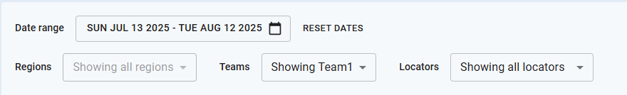
First you will need to set your filters, including Date range, Teams, Regions and Locators
Across top of the screen, you will see the average performance scores for all the locates completed as determined by your filters. Including the Average Locate Time Daily for the technician, as well as the Average Alert Resolution Time for supervisors.

The visual indicators on the map are very powerful and allow you to see at a glance the locate sessions and how the performance scores compare.
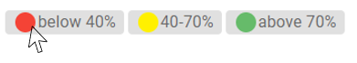
Each cone represents a locate session and is colour coded based on the locate risk assessment
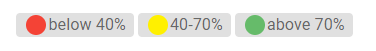
As you can see from the chart above, Green represents those locates with the highest scores.
-
Green above 70%
- Yellow 40-70%
- Red below 40%,
The 'height' of each cone will scale up depending on the amount of locator/receiver on time.
However, those that are 'Red' default to the tallest height due to the locate performance risk assessment score being below 40%.
Each colour can be turned On or Off in order to better view the data that you are interested in.
Additionally you can click on an individual 'cone' to view a bit more session data.
To the right of the screen, you will see the technician who completed the locate, his supervisor, other site information and the entire radar chart.
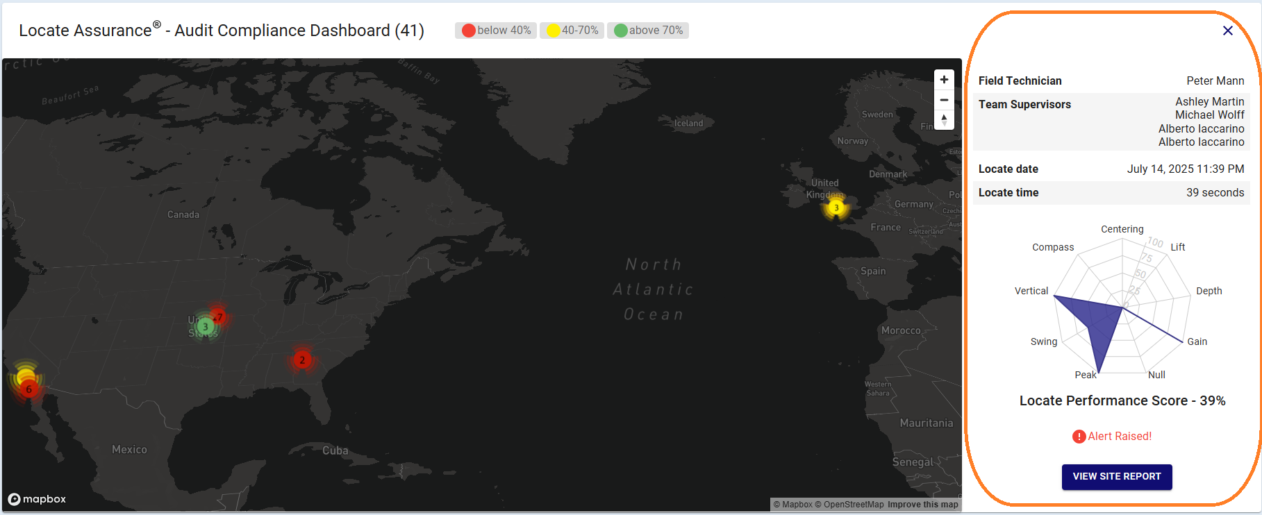
As you can see, the dashboard reveals a great deal of information instantly.